
EV Cockpit Design: Displays, Controls, Ergonomics and Safety
An EV cockpit is the driver's working environment: it must present essential information, keep time-critical controls predictable and support a clear view of the road, while screen count and dashboard style matter far less than how quickly the driver can understand and operate the car.
This guide separates visual design from ergonomics and gives you a repeatable way to assess any cockpit.
What a cockpit has to do
Every modern cockpit coordinates four layers:
- Driving: steering, pedals, drive selection, speed, lights, wipers and warning information.
- Vehicle assistance: cruise control, lane support, following distance, parking systems and driver monitoring.
- Comfort: climate, demisting, seat functions, mirrors and lighting.
- Navigation and media: route guidance, charging stops, calls, audio and connected services.
The first two layers need the strongest visual hierarchy and the most stable controls. Comfort functions should be quick to reach. Navigation and media can use richer screen interfaces, but they should not obscure driving status or demand long visual attention.
UN Regulation No. 121 requires covered controls to be operable by the driver and tell-tales and indicators to remain visible and recognisable by day and night. It also standardises many symbols, colours and identification rules. UN Regulation No. 121: controls, tell-tales and indicators
Four common dashboard architectures
There is no universally best dashboard. Each architecture can work well or poorly depending on display position, reflections, information hierarchy, response time and control design.
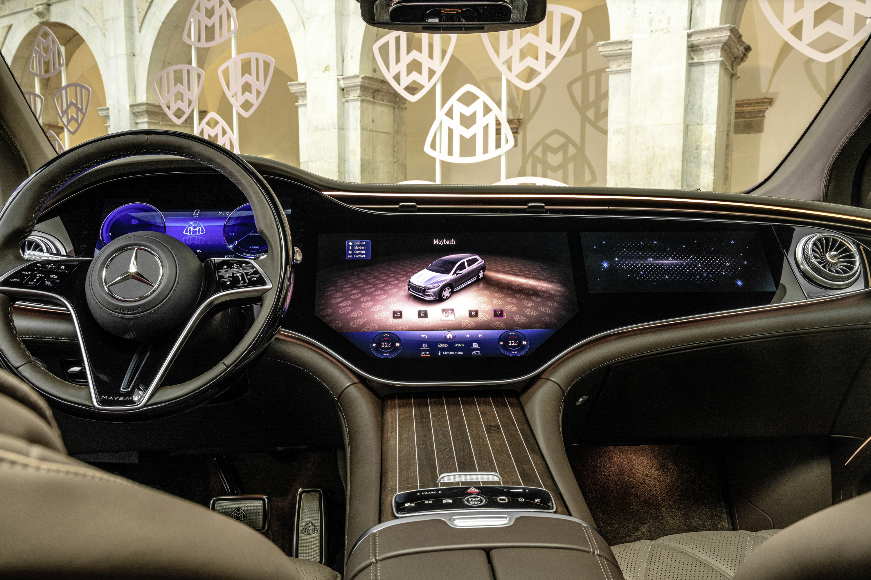
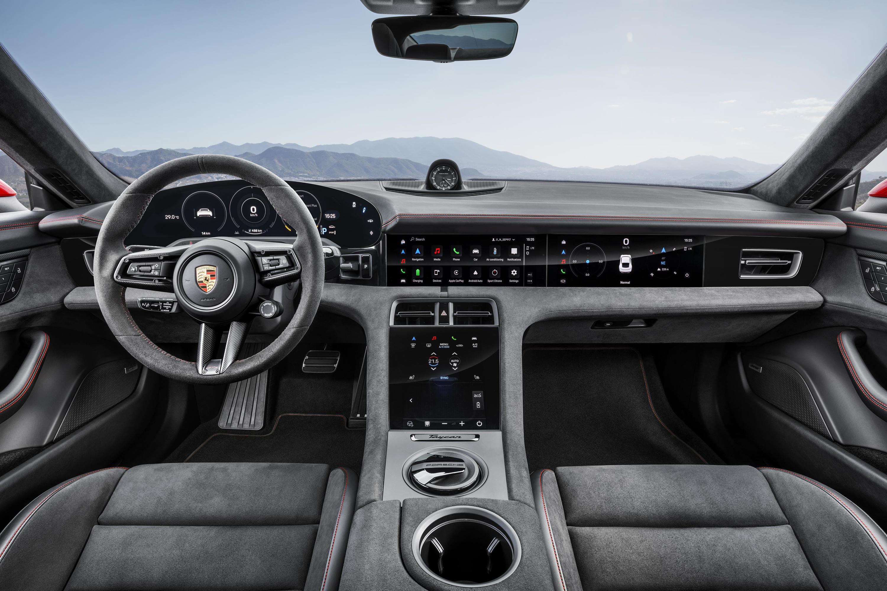
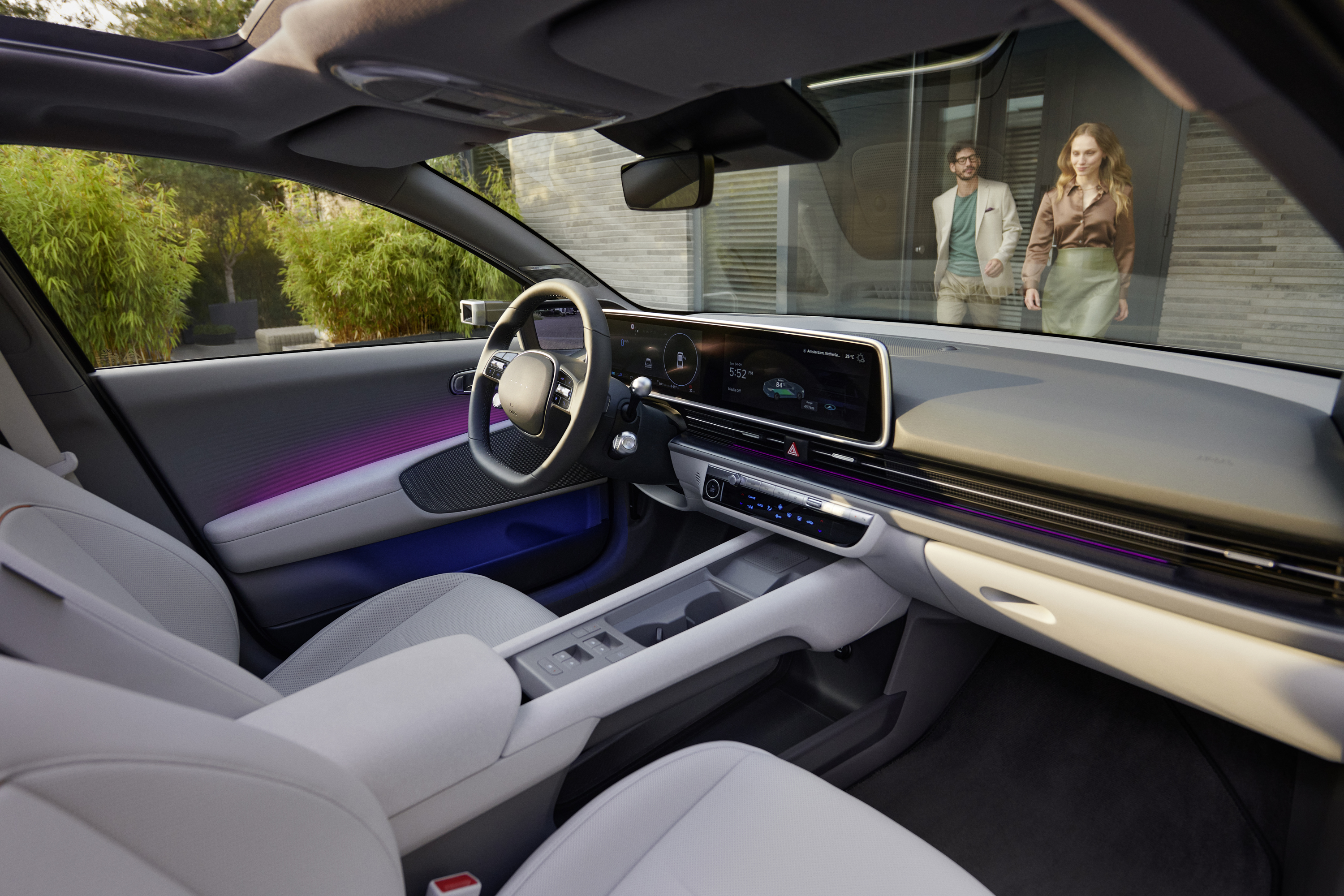
Integrated display architecture
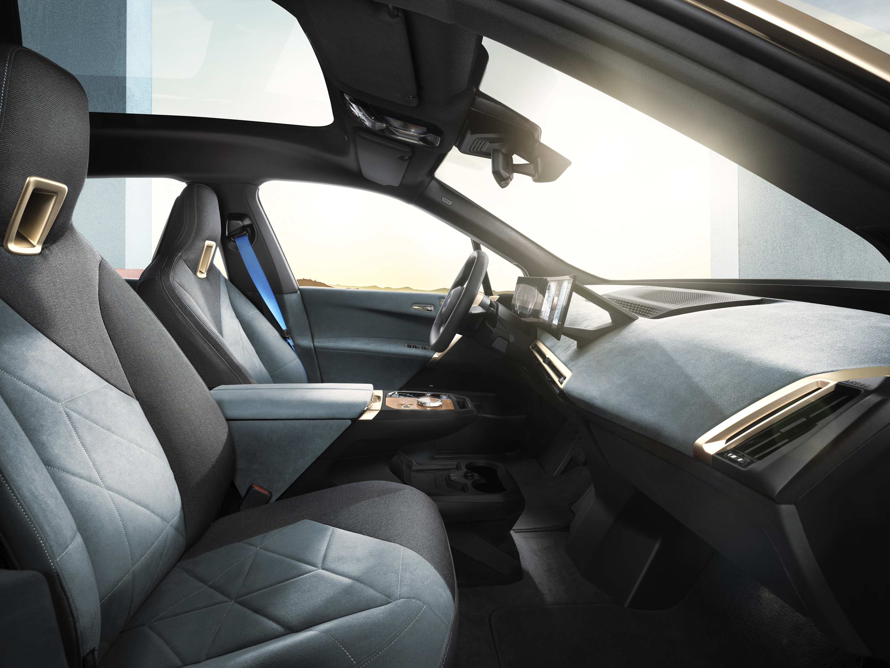
Screens, vents and controls form part of a continuous dashboard structure. Integration can reduce visual clutter and shade displays from reflections, but a wide glass panel is not automatically easier to read. Large dark surfaces can reflect side windows, and passenger content must not distract the driver.
Separate instrument and centre displays
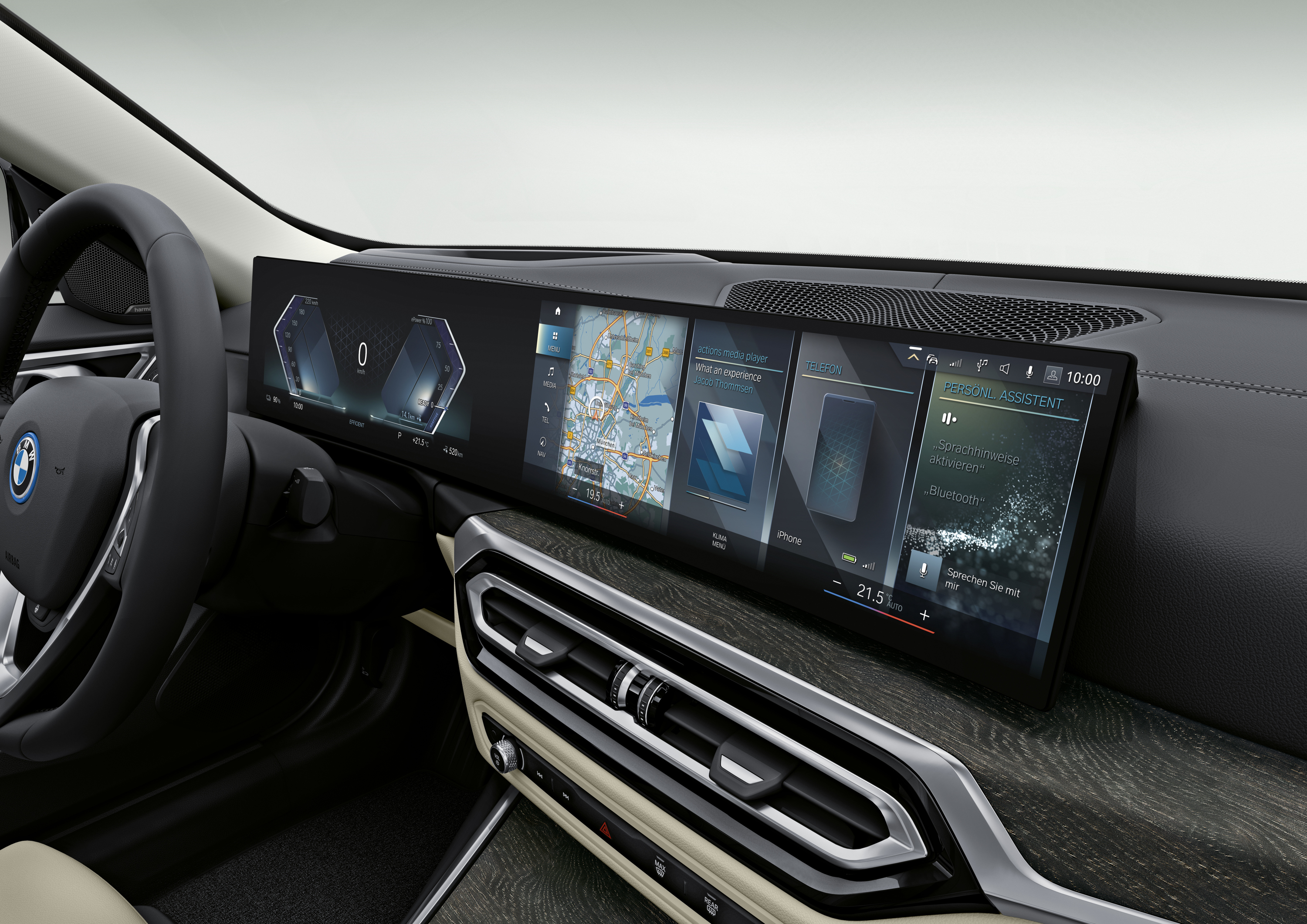
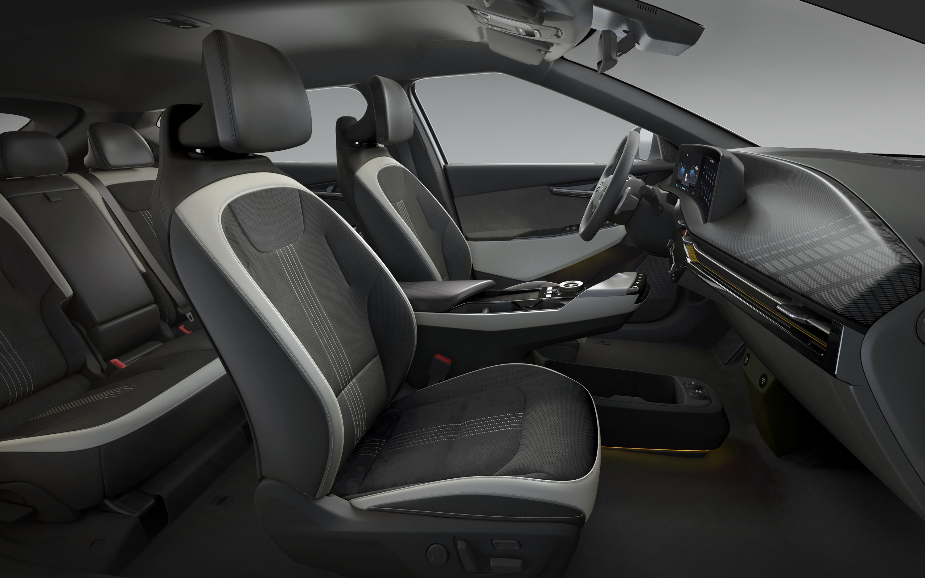
A driver display sits in the line of sight while a separate centre screen handles maps, media and settings. The division can keep essential information close to the road view and allow each screen to be positioned for its task. The disadvantages are duplicated information, several visual focal points and housings that may interrupt the view.
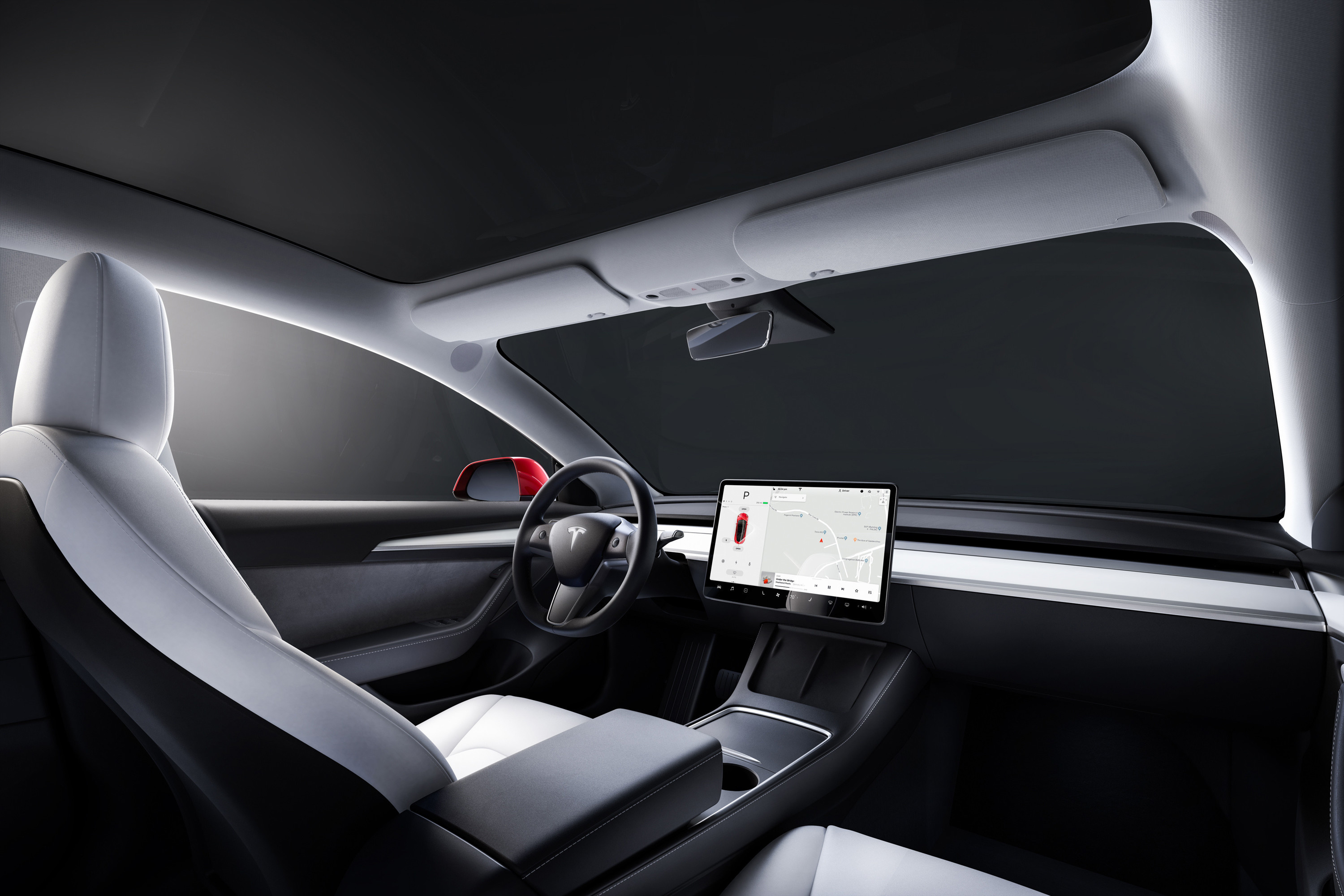
Single central display
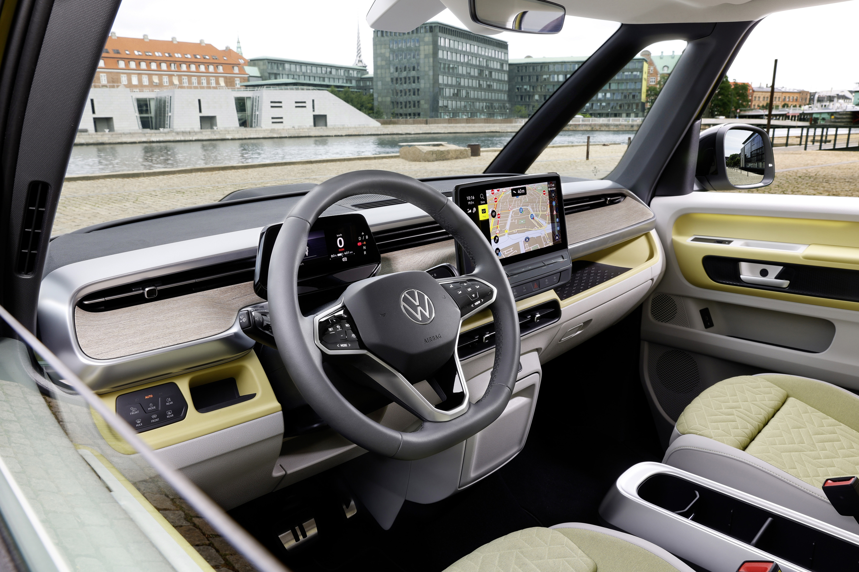
A low dashboard with one central screen can improve the forward view and reduce parts, wiring and visual clutter. It also moves speed and warning information away from the driver's direct line of sight unless the car adds a head-up display or another projection surface. Evaluate glance distance, font size and whether the steering wheel or a passenger can obstruct information.
Projection-first architecture
A head-up display or windscreen-width projection can place selected information close to the road view. It still needs a clear information hierarchy and a fallback display. Polarised glasses, driver height, seat position, bright sun and complex backgrounds can affect visibility. More projected content is not always better.
Read the dedicated guides to screens, head-up displays and EV information design for the underlying display technologies.
Put the right information in the right place
The driver should be able to locate current speed, critical warnings and the state of active assistance systems at a glance. EVs add information that changes the driving task:
- state of charge and credible remaining range;
- charging or energy-use warnings;
- selected drive mode and regenerative-braking state;
- power and regeneration feedback;
- route and charger availability;
- battery or cabin preconditioning status when it affects the trip.
The interface should distinguish status from advice and warnings from routine notifications. A coloured lane graphic, for example, should not make the driver guess whether lane centring is available, active or demanding intervention.
Placement is only one factor. Character size, contrast, motion, colour meaning, night dimming and prioritisation determine whether the information remains usable. A display that looks vivid in a studio photograph may create glare or reflections on a dark road.
Physical, touch and voice controls
The relevant question is not “buttons or screens?” It is which input suits the frequency, urgency and complexity of each task.
Physical controls are effective for actions that must be found by feel, used repeatedly or operated immediately. Touch interfaces work well for maps, cameras and infrequent settings that benefit from flexible graphics. Voice can reduce manual input for a destination or contact, but it needs reliable recognition, clear confirmation and a manual fallback.
Euro NCAP's General Vehicle Controls assessment, implemented in January 2026, classifies controls as direct physical, direct voice, always-accessible touch, touch within two menu steps or touch beyond two steps. For the functions it evaluates, a control more than two touch steps deep is never acceptable. The procedure also defines expected zones for direction indicators, wipers, high beam, hazard lights, the horn, drive selection and vehicle assistance. Euro NCAP: General Vehicle Controls Test Procedure v1.1
This does not mean every function needs a dedicated button. A strong layout uses:
- stable physical controls for urgent and frequently adjusted driving functions;
- a persistent touch area for common comfort functions;
- clear labels rather than unexplained icons;
- immediate visual, audible or tactile feedback;
- shortcuts that supplement a good default layout instead of repairing a poor one.
NHTSA's visual-manual distraction guidance recommends limiting tasks that require the driver to look away and interact manually with integrated electronic devices while driving. NHTSA: visual-manual driver distraction guidelines
Steering wheel and stalks
The steering wheel is prime control space because the driver's hands and attention are already nearby. That also makes accidental operation consequential.
Check whether:
- primary controls remain identifiable without looking down;
- rollers, switches and buttons have distinct shapes or detents;
- touch-sensitive areas react only when intended;
- the wheel rim or spokes block the instrument display;
- warning lights and driver-assistance status remain visible after wheel adjustment;
- direction indicators, wipers and high beam follow consistent positions and behaviour.
Removing stalks can create a cleaner appearance, but it transfers functions to the wheel, screen or roof console. Test a turn signal while the wheel is rotated, cancel a lane change, flash the high beam and operate the wipers. The control should still be easy to identify.
The steering-wheel guide, stalk guide and physical-button guide cover these designs in more detail.
Centre-console layouts
The centre console affects reach, storage, movement between the front seats and how open the cabin feels. Its shape does not determine quality; the useful test is whether it supports the occupants without interfering with driving.
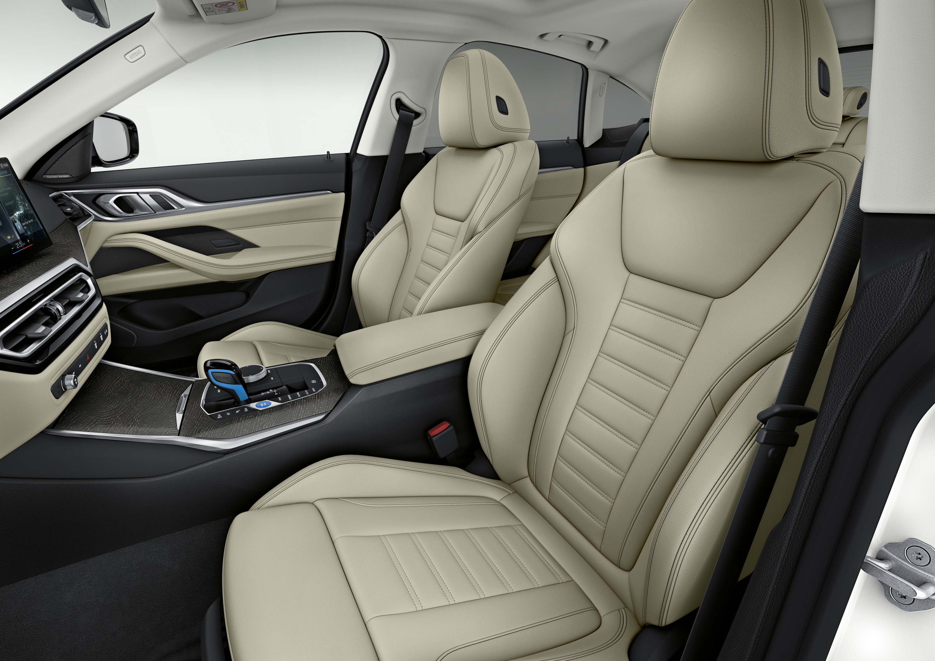
Full-height console
A conventional console provides a defined armrest, covered storage, cup holders and a stable surface for controls. It can also make a cabin feel narrow and consume the open floor made possible by an EV platform.
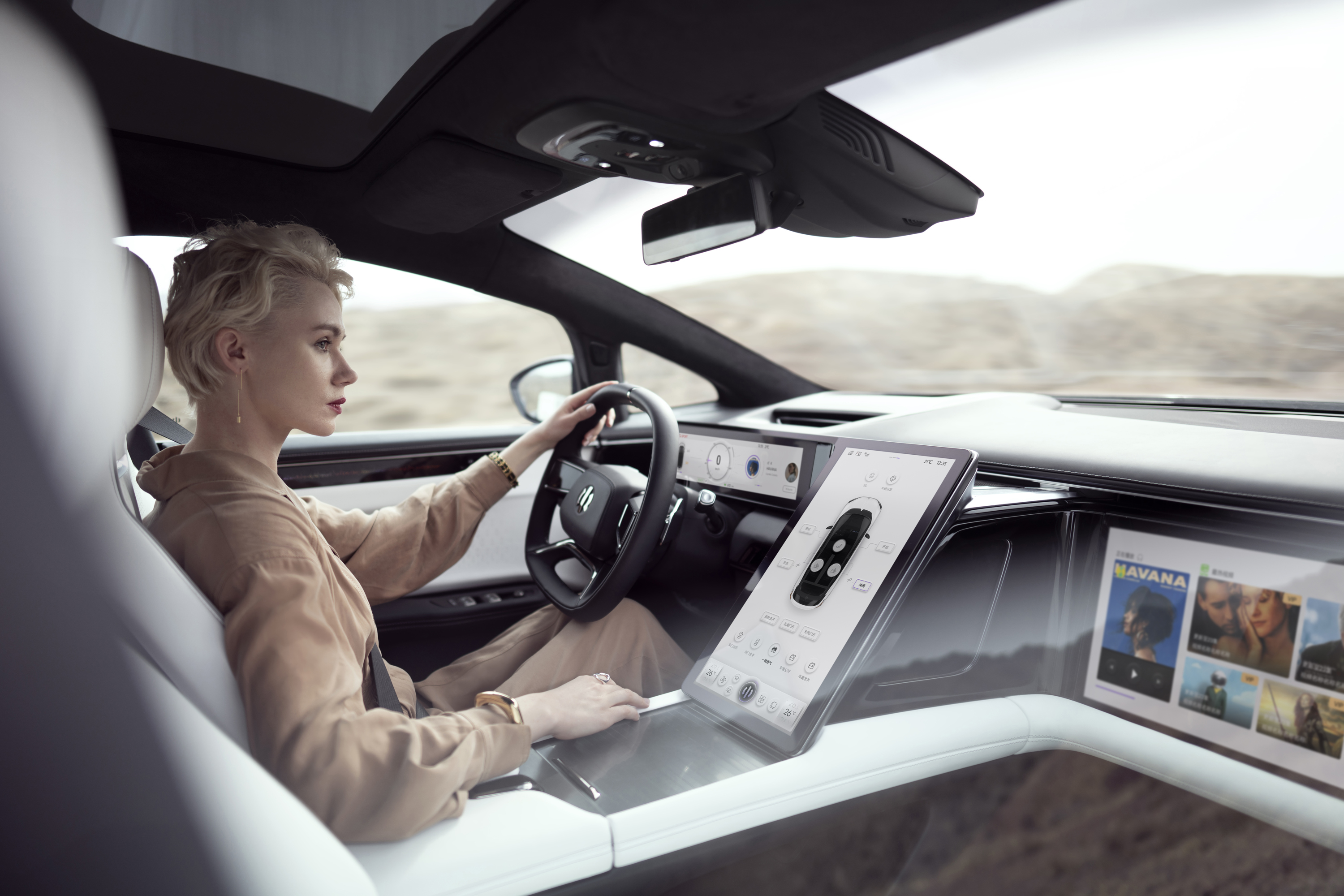
Dashboard-connected console
A console joined to the dashboard creates one continuous control and storage structure. It can place controls within easy reach, but the lower section may restrict knee room and small-item access.
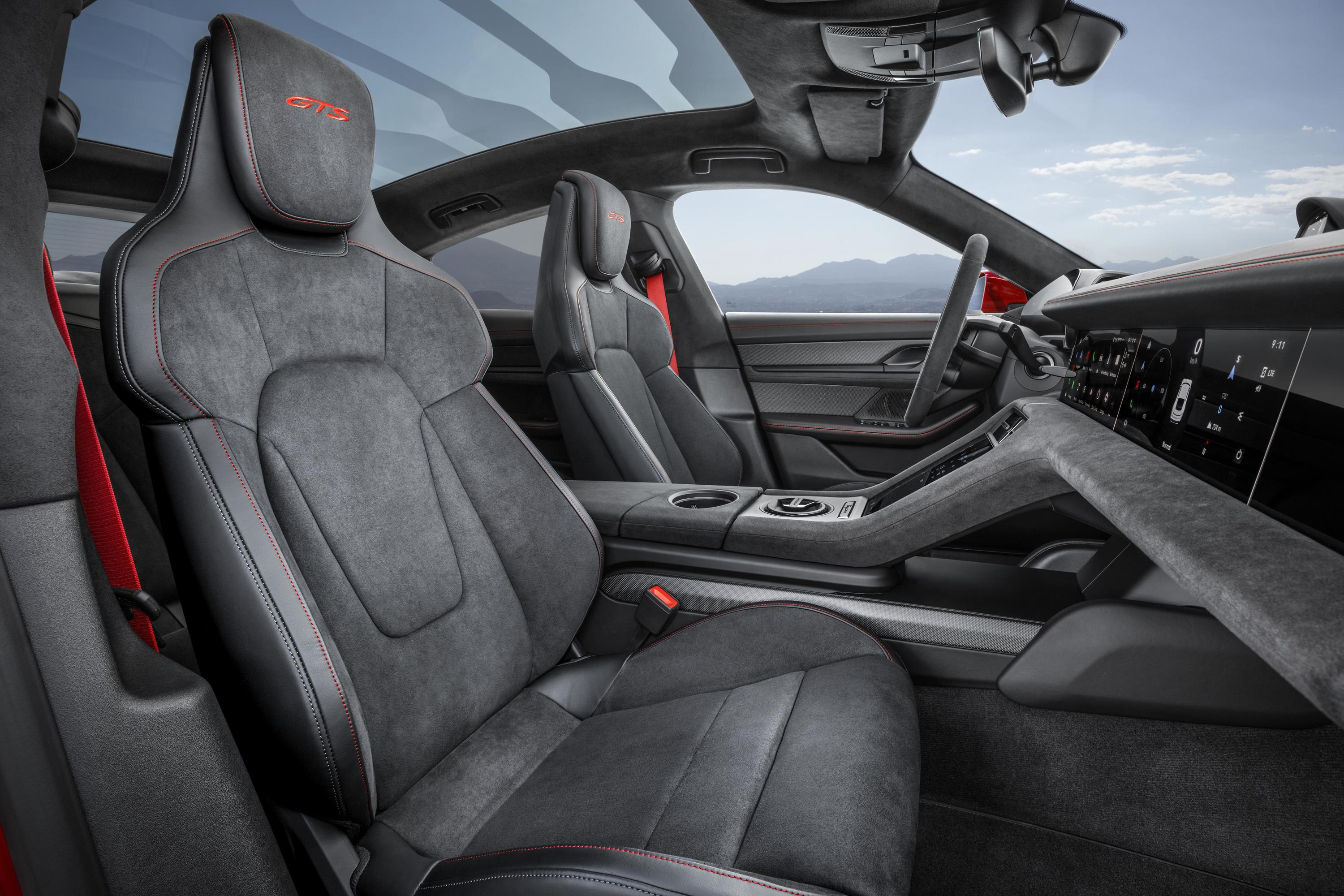
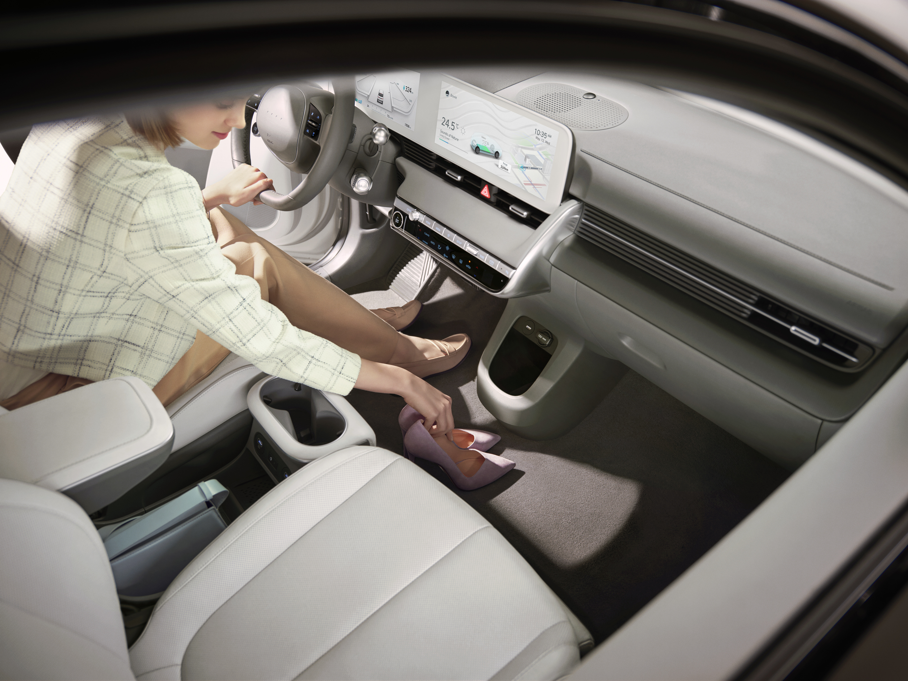
Floating console
A bridge or floating console leaves an open lower storage area. The arrangement can make useful space from the missing transmission tunnel, but loose objects need a retaining lip or covered compartment so that they do not slide into a footwell.
Armrest-only or removable console
An armrest and compact storage module can leave a clear path between the front seats. This is useful in vans and some EVs, although any removable unit needs a secure locking mechanism and an obvious place for phones, drinks and keys.
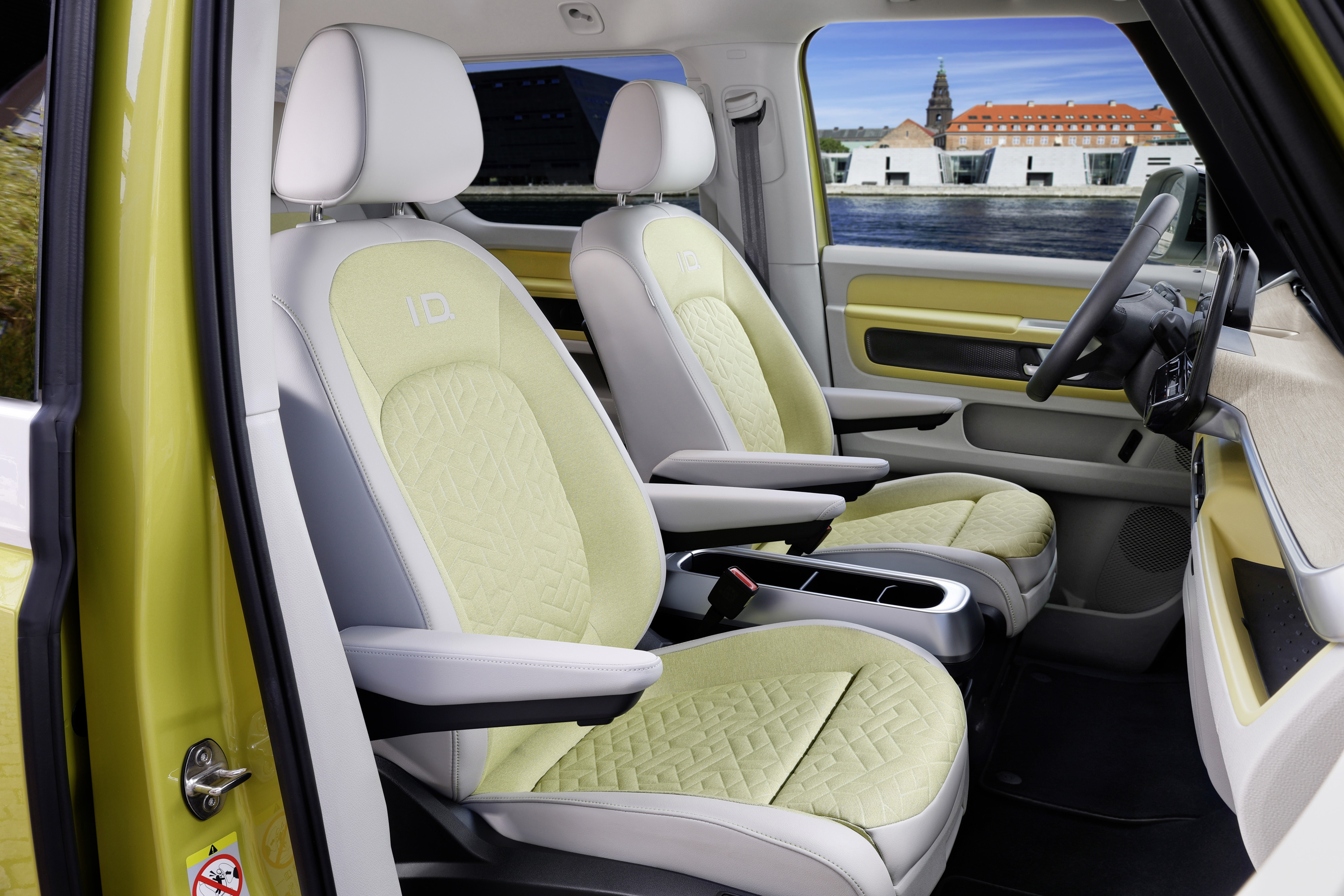
Split-level console
A split-level console combines an upper control or storage surface with a lower tray. It can increase capacity without adding a full-height wall, provided that both levels are reachable and items cannot interfere with the pedals.
The interior-storage guide explains how to judge each compartment rather than its photographed volume.
Driver monitoring and privacy
Many new cars use a camera or other sensors to estimate whether the driver is looking at the road. The EU's General Safety Regulation requires drowsiness and attention warnings in new vehicles and phases in advanced distraction warning. The law also states that these systems must not continuously retain data beyond what is necessary for their purpose, must process it in a closed-loop system and must not make it available to third parties. Regulation (EU) 2019/2144 on general vehicle safety
Test the implementation rather than assuming a camera makes the car safer:
- Does it recognise your eyes with sunglasses, ordinary glasses and varied seating positions?
- Are warnings timely and understandable?
- Can the driver tell which behaviour triggered the warning?
- Does the system avoid repeated false alerts?
- Does the owner's information explain what is processed, stored or shared?
Euro NCAP's 2026 assessment gives more weight to continuous eye and head tracking and to systems that adapt assistance or bring an unresponsive driver to a controlled stop. Euro NCAP: 2026 protocol changes
Visibility, reach and accessibility
Adjust the seat and wheel before judging the display. A cockpit that suits one body size may hide information or place controls beyond comfortable reach for another.
Look for:
- a clear forward view over or through the steering wheel;
- manageable blind areas around the windscreen pillars and mirrors;
- controls usable with either hand where appropriate;
- type, symbols and colour contrast that remain legible at night;
- alerts that do not rely on colour alone;
- enough screen brightness for sun and enough dimming for an unlit road;
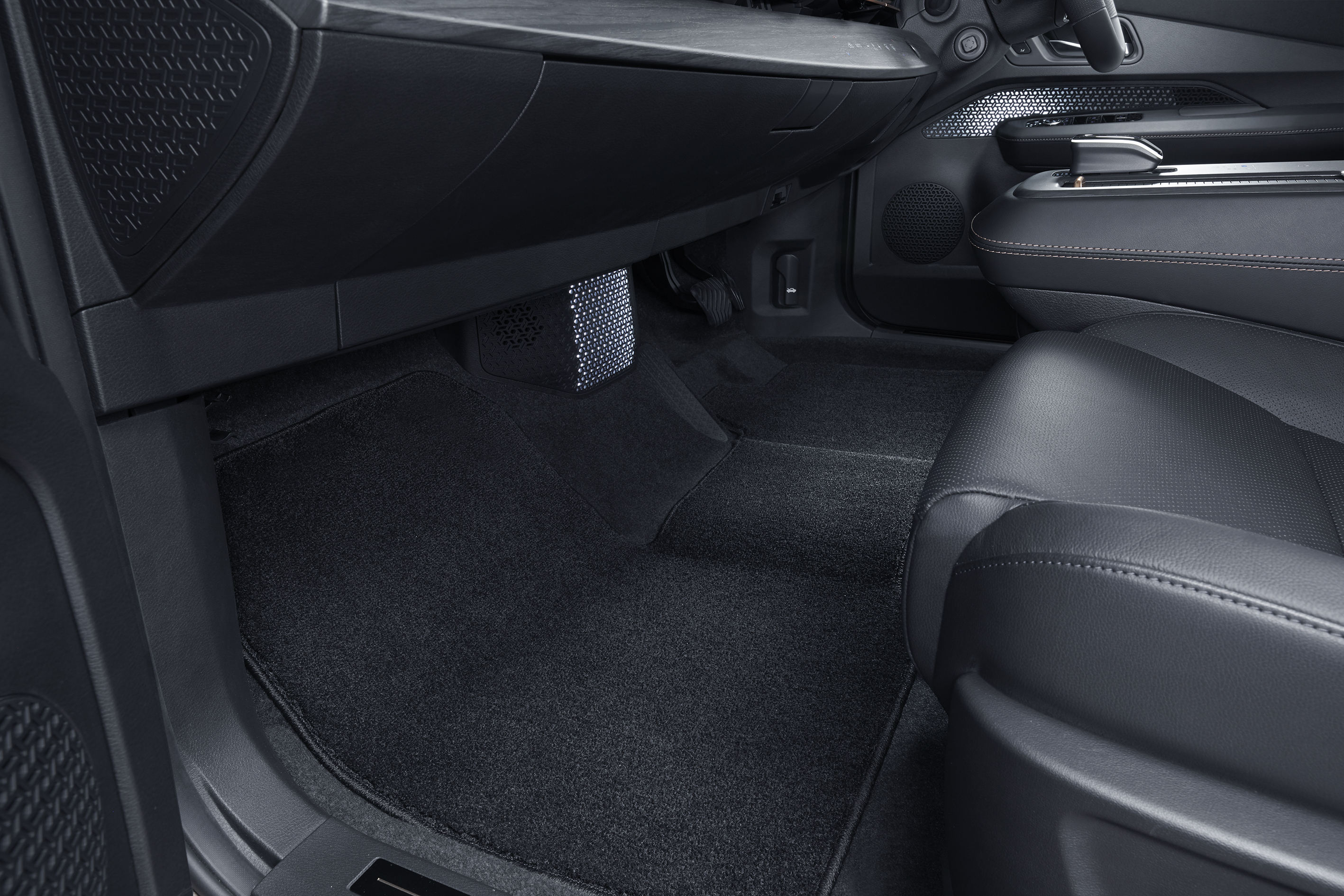
- surfaces that do not reflect vents, trim lighting or side windows into the windscreen.
Passengers matter too. A front-passenger display should not distract the driver, and a centre screen angled towards the driver should remain usable by the passenger when parked or handling navigation.
A repeatable cockpit test
With the car stationary and in its factory-default layout:
- Adjust the seat and wheel, then confirm that no essential information is hidden.
- Start the car and identify every active warning before it disappears.
- Operate indicators, wipers, washer, high beam, horn and hazard lights.
- Select forward and reverse, then return to park without looking for instructions.
- Change cabin temperature, fan speed and demisting.
- Set and cancel cruise control and lane support.
- Find state of charge, range, current consumption and charging settings.
- Enter a destination, add a charging stop and end guidance.
- Dim the displays and switch off nonessential ambient light.
- Ask another regular driver to repeat the test without coaching.
During a supervised drive, check response time, false alerts, reflections and whether any routine task forces your eyes away from the road for longer than feels comfortable. A good cockpit becomes easier after a few minutes without requiring the driver to memorise a changing interface.